Saturday 27 February 2016

DBA Hyperloop- Evaluation

At the beginning of this project we all focused on the research, researching into various areas such as how Hyperloop worked with the science behind it, researching into LA and San Fransisco as places and transport brands that are already around. Following the research in the run up to the first meeting with DBA we all each came up with a variety of ideas that we could run with, the range of ideas was large but we wanted to show the DBA our thinking and discuss them so far. We mocked up logos, shapes, patterns, vectors and maps as we were all unsure to what direction to go in. 

The feedback that DBA gave us was useful and pushed us in one direction. From the feedback that we received we realised we needed on clear concept, the concept we all wanted to go with and made the most since was to focus on affordable accessible travel, as Hyperloop is not a futuristic thing as it will be happening in the next 5 years. We formed our opinions and realised that Hyperloops design should be simple and communicate the message of getting from A-B fast. After us all trying to develop the logo we suddenly realised we could use the 2 o’s in the centre to communicate the concept. Adding a line in-between shows travel and how Hyperloop can get you from A-B simply. We chose Gotham as it is a simple and approachable type, we decided to use the typeface in two different weights for different circumstances. After confirming the final logo we then moved on to deciding on some colours, we all initially wanted to work with pinks and blues as they appeal to all. The colours then ran through onto the capsule and worked well. We then started to mock up the app, adverts and tickets and collect all of the information for the tourist guide. We printed the tourist guide and tickets to hand round in the presentation. The rest of our mock ups would be displayed on screen in the presentation.


The pitch went well and they understood that we only wanted to go for a simple design because we want Hyperloop to be an affordable accessible mode of travel. Overall, I am really happy with the way the Hyperloop designs have turned out and how it has all come together, we gained some positive feedback from the DBA and advice we can take forward in the future. 

Friday 26 February 2016

DBA- Hyperloop- Presentation


Feedback 

The feedback we have received off the DBA was positive, saying we have hit the aim of it being affordable accessible travel and not going for an overly flashy design. They focused a lot of looking at our logo and what that communicates, the picked up that on some of the logo’s the line wasn't central, and there was a couple of spelling mistakes within the publication, the small details is something we need to be careful of in the future. They liked the professionalism of the presentation and how the pink like flowed through all of the slides like the logo. They explained that Gotham is an American typeface so that makes it a good choice, however it is used on a lot in design so this could be an issue. They said the type could of be a little friendlier like easy jets. The colours we used were suitable for the target audience, they felt we could of pushed certain areas further. They said the dog advert gave Hyperloop more of a personality and tone of voice and maybe we could of developed that more. Overall the feedback has been really useful and they explained things that we can apply to other projects in the future. 

DBA- Printed Material

Tourist Guide, Tickets and Map

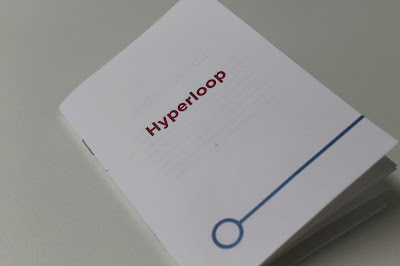
As digital applications can sometimes fail or phone battery die having printed tickets is worth while, also for people without smart phones. A ticket also gives tourists and commuters something to keep and look back on. Along with the ticket there is a tourist guide, as LA and San Fransisco are quite spaced out places, getting off the Hyperloop could become confusing and people not knowing how to get around once off the Hyperloop, so we have created a guide to assist with this. The printed guide also includes a pull out map showing the route of Hyperloop. 


DBA- Hyperloop- Capsule


We drew the cupsule out as a vector as the image provided was too low of a quality for the logo to be placed on. On the capsule we will use the full logo as we feel it will be needed to comunicate Hyperloop. The logo on the capsule will be in blue and pink would be added along the capsule to complement it. 


DBA- Hyperloop- App


An app will be essential for Hyperloop, 80% of the time spent on mobiles is on apps. The application for Hyperloop can include a variety of things, and e-ticket, a section to buy tickets, attractions in both LA and San Fransisco and the best places to eat and drink. As the Hyperloop expands over American and other countries so will the application. 

Thursday 25 February 2016

DBA- Hyperloop Final Adverts


Here are the final two adverts that we are going with, they both feature a coloured bar at the bottom of the advert with a white Hyperloop logo, the colour keeping the brand consistent. The adverts show the main points of our concept being affordable, accessible travel. 


Wednesday 24 February 2016

Anorak Magazine Talk

Anorak Magazine came in today to do a talk, I have previously contacted Anorak magazine for COP3 as they were relevant to the publication I was creating, I have always admired this magazine and they gave an interesting talk. 

The magazine was created as she became a mom and couldn't find any decent printed publications for her son. She put all her savings into this magazine to get it started with illustrators and creatives. Each Anorak magazine has a different theme. The illustration style usually has three layers to it. 

Fear and friends has been there best selling issue, the cover shown below. An issue for children struggling to understand new friendships. 


Within each issue there is severn stories included.

Anorak also do activity books and a publication for 5 and under called DOT. 


Anorak are now coming up to celebrating their 10th Anniversary. 


DBA Hyperloop- Advert Development

I have started to look at how we could advertise Hyperloop, my initial idea is to use a picture of LA and San Francisco in the background and have typer overlaid on the image. 


The type in the centre then turned into a banner across the image, Hyperloop will be placed at the bottom of the advert.


For the portrait adverts for bus stops I have chosen portrait images of LA and San Fran, I don't think these adverts stand out enough when in context. 


To try and make the advert stand out more 


To add more of a humorous tone to Hyperloop and make it feel more personal we decided to look at dogs on skateboards as an advertising technique as it will make people look and actually pay attention to Hyperloop add’s yet still portray Hyperloop as a mode of travel. Hyperloop is aimed at a large target audience so having a dog as the advert will appeal to all. 

Tuesday 23 February 2016

DBA- Hyperloop- Transport ad Research


British airways have clean, clear and effective advertising techniques. I particularly like the rock advert having the type in the rock and also incorporating British Airways colours. Much like Easy Jet their other approach is bringing people together. The second advert is cleaver, the people coming together and forming an airplane shaped shadow. 


Easy Jet use their orange brand colour thought all of their advertising campaigns. Many of their adds use the theme of love in their advertising and bring people together. They also go for quite a tongue and cheek approach when it comes to advertising also. 


KLM is an affordable airline for all, they use blue throughout their adverts to keep the brand consistent. The top advert has a cleaver touch however some consumers may not understand what it means. The middle advert advertise how cheap it can be to get away, and the bottom advert makes the consumer want to be there. 


Virgin can have quite a humorous approach when it comes to advertising, the top adverts feature innuendo’s to catch the audiences attention. Personally I think the middle advert is the best as it looks quite vintage, I like the use of colour and how they have made the train fly to prove a point. The last advert is made for virgin atlantic a more upperclass advert.