Monday 20 April 2015

PPP2 Presentation


Presentation notes


1. LAST YEAR

• Started PPP by reflecting on last year and my branding
• Realised how bad it was
• Don’t think it represents me at all and neither does anyone else
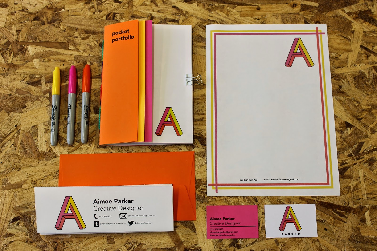
2. PROMO PACK

• Created a new logo for myself
• A simple ‘A’ using three colours
• Chose bright colours as I think they represent me best

3. WEB

• Would like my website to be much like my Tumblr now
• A simple visual theme displaying images of my work
• As you hover over the images they will change colour indicating that they are clickable
• once clicked on a project the image will become larger, able to scroll through the project with a short description

4. HAND DRAWN TYPE

• Something I have enjoyed and developed this year
• developed through working on responsive projects and being the graphic designer for the cheese society

5. COLLABORATION

• Collaborative project for responsive has been my favorite project this year
• Worked with two illustration students that I didn’t previously know
• We worked on YCN Taylors Coffee brief a brief to ‘engage the younger audience with a new taylors coffee product’
• After primary research we decided to create a refillable jar of coffee and three packets of occasion and time of day. Morning to wake you up, midday to keep you going throughout the day and a decafe night time one
• We created the artwork using textures of paint and collage

6. STUDIO MOROSS

• When in London I visited studio moross as Kate moross has always been one of my biggest inspirations
• the studio was closed so I decided to write her a letter
• didn’t get a  reply, however I am going to send her an email in the near future

7. STUDIOS OF INTEREST – CATALOGUE

• A studio in leeds and London that pride themselves on visual identity, web design and development and print
• Partially like the work they did for Beacons festival and The Belgrave
• On the website it says don’t participate in internship schemes, I e-mailed anyway and got no reply

8. PETER AND PAUL

• A design studio based in Sheffield
• Liked their variety of work
• Contacted them asking for placement and they told me to get back to them when I’m in third year
  
9. ROBOT FOOD

• Another studio that interests me is Robot Food in Leeds
• Creating a lot of vibrant work
• A studio that I am going to contact in the near future

10. SPLIT

• After contacting a variety of studios that I am interested in one studio got back to me which was Split in Leeds
• Oli the creative director of Split said he really liked my work and asked for a chat in the studio
  
11. SPLIT EXAMPLES OF WORK

• Here are some examples of splits work
• They do graphic design for print and web
• I partially like their identity projects
• On the left is some work they have done for Leeds college of music, in the middle is Keswick film festival and on the right is an identity project for a bakery called ‘That old chestnut’ 
• Went for a chat with Oli at Split and I spoke through all of my work on my Tumblr and Behance
• Went through all of the briefs he was working on at the moment and asked which ones I would be most interested in working on 
• He said what my Behance and tumblr was lacking was any examples of type setting he asked me to e-mail him some work
• I e-mailed him some work and waited for a reply after Amsterdam this Easter and he explained that the timing just wasn’t right and he has had a lot of movement on a photo shoot he was art directing and he wanted me to work in the studio with him
• He was very apologetic and told me to contact him again in May and he said he will see what he could do

12. LEVEL 6

• In level six I would like to do more collaboration as that is something I enjoyed this year
• I would also like to look into more identity projects and possibly develop my web skills

13. SUMMER PLANS

• This summer I plan to go on placement with either split or another studio
• And I’m going to Glastonbury, Thailand for three weeks and Outlook festival


Sunday 19 April 2015

OUGD502- End of Module Evaluation


I have enjoyed working on this project however at times it has been hard. I started to create my logo and realised how difficult it is to search for your real personal identity. If you are working for someone else it is easier to know what the client is looking for, but being your own client can be tricky.

Looking back and reflecting on my first year PPP and the identity I created for myself then I quickly realised how much has changed within the year. The identity I had given myself last year I don’t feel as if it represents me well anymore. I asked other people what they thought of my old identity and they felt like it didn’t represent me at all. I new I wanted to re design my logo but I just wasn’t sure what I wanted it to look like. I asked my friends and peers what they thought would represent me as an identity and they responded with bright colours and bubbly hand drawn type.

At first I experimented a lot by hand with my logo, drawing out my name a lot but there was just nothing that I thought looked right. I liked the idea of colour within my identity but was unsure about hand rendered type because I don’t want people to think that is the only thing I can do as I do enjoy other aspects of graphic design. After much experimentation I looked into the letter ‘A’ and the shapes within it, I drew out my logo by hand a letter ‘A’ but 3D with three different colour panels that I could use. I chose orange, pink and yellow all bright tones that fit together well, I chose these as I think they are warm eye catching colours that represent me best.

Within my promo pack I wanted to include a few things, something that showed my work from the past year, business cards, letterhead and a creative CV that can be handed out studios I admire. I started to design my CV and realised I had quite a bit to put on it, so it took quite a bit of organising to get the layout right for it to all fit on one A4 page. I decided to display my work from the past year I was going to present it in a zine and call it ‘pocket portfolio’. I made the zine image based with small descriptions of each project in the index. I bound the zine using saddle stitch another binding technique that I have improved on. I am really happy with the business cards I have created as I think they represent me well and I would be happy to hand them out to people and design studios.

For my website I wanted it to be a lot like my tumblr now as it is a simple visual theme. At the moment to display my graphics work I have a tumblr and a Behance both I use and update on a regular basis. In the future I would like to have my own website so I decided to look into the design now. The design I came up with is simple, visual and effective. A three column design when you hover over an image it turns to a colour, you click and a range of images from that project will appear and a short description, also within the website would include a bit about myself, and a contact page.
This year within PP I have contacted a lot of design studios but haven’t had a lot of luck. In the summer I contacted a studio in Bangkok while I was there called ‘NonCitizen’ they wanted to meet me for a chat but failed to mention they had moved studio after me walking round Bangkok lost for three hours. Also in the summer I turned up at ‘Ludlow Kingsley’ a design studio in LA and they weren’t willing to speak to me. In January I visited Kate Moross’ Studio (the outside of it) ‘Studio Moross’ the outside was everything I expected and more, so I decided to write her a letter. I didn’t get any response back off Kate Moross but I am looking to e-mail her again in the future. I emailed various studios of interest asking if they offered placement and one studio that did get back to me was ‘Split’ a studio in Leeds. I went for a chat with Ollie a member of split, I went through my work and he said he would love to work with me, I was going to work with them over Easter but the timing wasn’t right so I am looking to work with them over the summer possibly for a longer period of time. I have learnt a lot from contacting studios and I think this year I have gained a lot more confidence in doing so. The meeting I had with split was nerve racking but very worthwhile as I feel I can now talk about my work with more confidence.


I have enjoyed PPP this year, reviewing my identity has been very worthwhile and I am happy with what I have produced as I think it represents me well as a creative. My aim for over the summer is to get some sort of placement within graphic design and to get my own website live and up and running.

Thursday 16 April 2015

My Brand- Self Promotion


My final self promotion pack includes:
• business cards
• a pocket portfolio 
• creative cv
• letter head 

Overall I am happy with the way my self promotion has turned out. The pack works well as a set using coloured stock to complement the logo has worked out well especially on my business cards. I have managed my time effectively while creating this pack, all of which I could use in the future to send to studios. My promotional pack shows my identity working on a range of scales. One main concern I do have with my promotional pack is reproduction as there is quite a bit of colour making reproduction costs quite high however all of my pack can work in black and white and still portray my identity. If I had more time creating my brand I think I would of liked to have spend time exposing my logo for screen print to print some envelopes properly. 


Wednesday 15 April 2015

Website

My online portfolio's 


I would like my website to be much like my Tumblr (above)


a simple layout that enables to view all of my work as a collection with no overwhelming text

for my website I would like a very similar theme however I would like to format it so when you click on an image you get a short description of the project maybe with more images. 


Behance displays my design wok effectively in a portfolio manor


Simple websites that display their work well 


This is Catologue Leeds website, it is very simple and easy to use. As it is so simple and there are no other colour on the website it shows off the work more.


What I like about Kate Moross' website is that her work scrolls through landscape from the right. I like how the links are colourful but it all fits in with her work. As you click on each image the project comes up with more images and a short description. 


Robbie Porters website again has a very simple theme, all of the links are at the top of the page and then just images of his work, much like my Tumblr now. 


Hattie Stawarts website is simple again with four links and a clickable portfolio of work.


Some scamps of ideas for my website, simple ideas displaying my work effectively 


Website ideas


After making my scamps and working out how I would like my work to be displayed I have mocked some ideas up digitally to see how they would look.

Above is my first idea, a basic website with squares of my work and links at the top to contact information and social medias. This would work as you click on each image the image will enlarge and you will be able to click through the project there will also be a description of the project displayed. 


Above is another idea of having no gap in between each project and having more of a rectangle shape. I think this works well but i'm not sure whether my website would just look over crowded 


As you hover over each of the images they would turn either orange or pink (colours out of my logo) with the title of the project in white, this way you know what the project is before clicking on it. 


Final Website

For my final website I have decided to go for a simple design as I want my website to be mainly image based and I don't want it to look over crowded. It is a simple three column design where an image would be placed in each square to make the consumer want to view the project. 


The website would scroll through revealing more projects in the same square format. The header at the top of the page will be fixed so at any point the consumer can click another link or view a project. The website needs to be interactive enough for the consumer to want to stay on the page but not too confusing.


As you hover over the project the title will appear and the image will turn either orange or pink


Get in touch


The get in touch page will be of a simple format, my contact details including my phone number and email and a space to write a message/ question and submit.


About


The about page will include an image of me and a bit about myself as a creative


Projects


As you hover over each project it will change colour and the title of the project will appear. Then as you click on the project a larger image will appear in the centre of the screen where you are able to scroll through the images of the project and after you have gone through all of the images there will be a description of the project. As soon as you have clicked on the project the curser will turn to an arrow to indicate you are able to click through the project. I think this works best as the focus is on the visuals.


Pocket Portfolio

As part of my promotional pack I wanted to show examples of my work from second year. 
I have decided to make an A5 zine and name it 'pocket portfolio'. I would like the zine to be image based and not include much text but a short description of each project at the back of the zine. 
As it is just image based of images of my work throughout second year the zine will have a simple design with an intro explaining what it is and each project will have a project number corresponding to the number in the index with the description of the project. 


Above are screen shots of the page spread of the zine using orange dots not as page numbers but as project numbers to correspond with the description of the project in the index. 

Printing and Binding 

I did a couple of test prints of the zine before I printed it finally, to check the pages went together and to see if everything worked as a zine. When finally printing the first copy came out on A3  because this is how I set the document up, when I set the document up as A4 i didn't think it meant each page was A4 i needed it to be the full spread. After scaling down I got it to the size I wanted. 


To bind the zine together I decided to go for a saddle stitch with some multicoloured wool, securing all of the pages together and adding a decorative touch. 


One difficulty I did have when binding was getting the coloured card for the cover in the right position ready for binding, I used bulldog clips to hold it all down then marked out the centre added where I would like the holes to be and put the holes in ready for binding. 


One mistake I did make on the A4 test print is cutting too far in and nearly cutting the project numbers off. Having this test print was useful as I practiced my binding and cutting down on this before making any big mistakes on the final pocket portfolio. 


Final Zine


Overall I am really happy with the way the pocket portfolio has turned out. In the future this will be something I will look back on and see all of my second year work. I could reproduce this mini portfolio and mail it to studios of interest as many of them don't bother reading your emails but with post they more than likely open it.