
Made by Analoge- Leeds

A multi-discipline
creative design agency. Our passion for innovation, craft and compelling
storytelling means that we can help you achieve head-turning results.
Everything we create, no matter the medium, harmonises with our clients’ brand
DNA and business objectives.
Two of my favourite projects that this particular design agency has worked on is the sponge bob packaging and the pizza express flagship store in China.
SpongeBob Squarepants
SpongeBob isn't the worlds favourite animated sea-sponge for nothing. When Nickelodeon Made by Analoge to design global packaging guidelines for SpongeBob merchandise, they will thrilled. Like the enthusiastic character himself, the guidelines had to be playful, iconic and push creative boundaries.


Pizza Express
Pizza Express were opening their 500th restaurant in Beijing. Their flagship, no less. It is to be the best pizza express in the world, they asked Made by Analogue to adapt the brand and apply it across all decor, staff uniforms and collateral.


Split- Leeds
A small agancy based in Leeds, West Yorkshire, specialising in creative graphic design for print and web.
"We’re passionate about helping individuals and organisations to realise their potential through the design process.
Working closely with our clients to fully understand and appreciate their needs, we aim to produce work that is that is considered, has real heart and doesn't break the bank.
To us, design is about creating engaging concepts that effectively solve problems and balance the many factors of a brief. Its about never having to sacrifice creativity in the process, and about executing these concepts in the most effective and appropriate way, with care and attention to detail."
Split work on some great projects, I partially like their identity projects. Here are just a few I admire
That Old Chestnut
That Old Chestnut are a great bakery first and foremost, though they are also a vegan-only bakery.
Wanting to build on a fantastic local word-of-mouth reputation, they came to us for a full rebrand, to create an image that reflected their ethos and the quality of their cakes. They wanted their brand, just like their produce, to be locally sourced, natural and ethical, honest, and down to earth.
We worked with them on a new identity design, stationery, promotional print material, limited edition letterpress posters and a fully responsive website (...oh, and lots of very important "product research").


Leeds College of Music Students Union
LCoMSU commissioned us to create a simple, welcoming and approachable brand that was flexible and easy to apply across a wide range of digital and print material.
The resulting identity is based on sound vibrations, creating a simple yet distinctive mark. This is supported by an expansive icon set, covering the wide range of the union's activities, that is applied across everything from from the freshers welcome packs, to T-shirts and lanyards, to a fully responsive website.


Mum's Cooking
Mum's Cooking deliver home-cooked meals to student accommodation in Leeds, providing a more wholesome alternative to the takeaway (but without the washing up).
With plenty of fun to be had with the name, the brand combines the visual style of the 1950's - an era when wholesome cooked food was at the heart of family life - with a down-to-earth, no nonsense northern tone of voice.


Duo is a studio made up of two creatives, Paul & Emily, creating new big things. In their two heads there is more than 14 years experience working together in the creative industry and we occasionally knock them together to spark new ideas. Here are just a few projects of theirs I admire:

Leeds College of Art
Leeds College of Art is an independent, specialist and dynamic place to study Higher Education courses, and since it’s been around for quite a while (est. 1846 to be precise) this well known establishment thought it was high time to create an identity for it’s plethora of alumni.


Food Newcastle
Food Newcastle promotes the city's Food Charter, which represents a huge step forward for Newcastle's participation in Sustainable Food Cities; an innovative national programme which is being delivered for a shortlist of twelve cities in the UK. This is a real badge of recognition and honour for the brilliant work already happening throughout Newcastle, encouraging its vibrant and exciting food culture to go from strength to strength.


Mo Styles
Mo Styles has been able to build up a strong body of work covering live music, travel, event photography and production.Mo came to us looking to create a new logo and brand for his photography, one that needed to reflect his speciality style of contemporary urban images from all over the globe. We chose a font that would reflect his individual flare and friendly personality as well as associating with his style of underground photography.His logo works well across his website and continues to act as a stylistic signature for his work.


Orb- Birmingham
Since 2004, Orb branding agency has been helping high growth SME's and ambitious entrepreneurs define and grow their brands. We also provide strategy and clarity for larger organisations looking to engage with smaller businesses.

Glide
Over the past 5 years —
further to continually updating the Glide brand and visual identity as the
business grows — ORB have also managed all marketing and PR activity for Glide
to ensure the brand is communicated as consistently and effectively as
possible. To further ensure all Glide employees completely believe in the
company’s vision, ORB also regularly designs and hosts company-wide away days
to boost employee engagement and further accelerate the company’s impressive
growth.


The Quarterly
The Quarterly editorial
team had already worked together to create a website called The Creative Book –
A place where talented creatives from around the world can showcase their
portfolios, network and connect with others.
Once The Creative Book
was established, the team set their sights on the world of publishing.
As most journalists and
photographers will tell you, magazines tend to rip people off. Just mention the
word exploitation to any photographer or journalist and they’ll shiver at the
number of times they’ve been asked to work for free. The Quarterly team said
hell to all of that and asked us to help them launch a beautiful publication
which shares all profits from sales equally and doesn’t fill its pages with any
ugly advertising.


Raw- Manchester
We create effective pieces of design and creative communications, with a focus on craftsmanship and collaboration.
Ours is a simple approach: we take the time to get to know our clients, we do all that we can to understand the people they're trying to reach, then we take what we know and create memorable, relevant pieces of work.

NHS Summer Health Campaign
We used an illustrative approach to capture the imaginations of 35-55-year-old men in Barking and Dagenham and encourage them to engage with their health and wellbeing. The campaign needed to appeal to the predominantly white, working class demographic, communicating the serious health issues in a humourous, light-hearted style. We created a pastiche of the cult 'saucy seaside postcards' produced in the 1950s by graphic artists, such as Donald McGill, using Garry Walton's illustrations to bring the vintage feel to life.


Wolves Brand Refresh
Wolves commissioned us to rebrand the club and its many sub-brands. We engaged staff and supporters - from the tea lady to the chairman - to try to get to the heart of Wolves and to understand what it really means to be a fan. The strong, geometric nature of the crest provided us with the inspiration for the sub-brands and signage, and a strong core message was created that encapsulated the Wolves mission. A new typeface and colour palette have also been introduced that reflect the club’s personality and give new marketing material a consistent look and feel.


Peter and Paul- Sheffield
Peter and Paul are a design studio from Sheffield with some interesting recent work, they are currently updating their new website but here are some projects that got me interested from the old website.

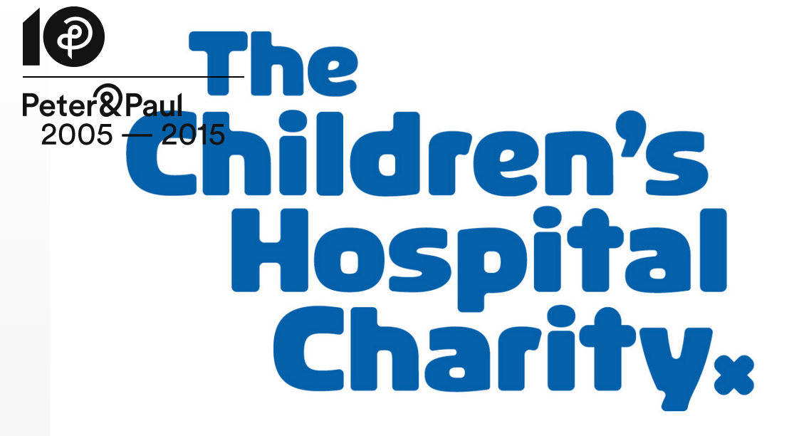
The Children's Hospital Charity
I really like the illustrations done for the children's hospital, they are child friendly but also appeal to adults by being quite cute.

Sheffield Institute of Arts
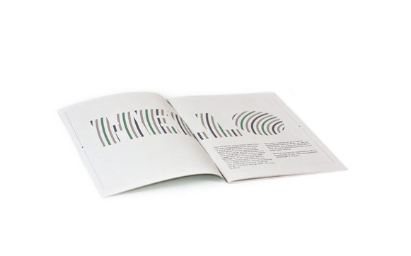
This is a prospectus Peter and Paul created for Sheffield institute of Arts, what I really like about it is the hologram effect the front cover giving that unique touch.

Substract- Birmingham

A team with the creative passion and experience to help you
get the best from considered design and intelligent digital media.
get the best from considered design and intelligent digital media.
Art Map Wolverhampton
Art Map Wolverhampton is an integral part of Project Dandelion, a public art project that enables new art commissions and projects to take place across secondary schools in Wolverhampton. Supported by Centro, Substrakt was brought on board to work alongside the students and produce a printed map and website showcasing art and culture across the city for visitors and residents.


Catalogue is a London and Leeds based multidisciplinary
graphic design studio founded in 2011 by Tom Pratt and Oliver Shaw. We work on
commissioned and self-initiated projects specialising in visual identity
systems, web design and development, printed matter, art direction and
publishing in the cultural and commercial sectors. We work closely with our
clients, delivering clear and coherent solutions.
We have worked with a range of businesses
and individuals. Clients include; Pepsi P.C., Urban Outfitters, Leeds
University, Beacons Festival, Belgrave Music Hall & Canteen, Krammer &
Stoudt, Platform Creative, Leeds College of Art, Beach London, Nous Vous and
many more.


This is one of my favourite studios I have come across. There work seems to be very on trend at the moment and they have worked with some great clients.
Beacons Festival
I love the branding of beacons festival especially the use of colour and photography.


Belgrave Music Hall
Having been to the Belgrave myself I can see these designs fit in with the brand well. The use of colour and block type make it really stand out.


Teabag Digital- Leeds
We’re teabag, a digital agency based in
Leeds. We’ve been making websites, brands and animations since 2003. Now that
you’re here, stay a while. We hope you like what you see.
We’ve been developing brands and flexing
our creative and digital skills for our clients for well over a decade.

Red's BBQ Website
We built Red’s a new website to keep up
with their fast growth. Ahead of their fourth restaurant opening in Nottingham,
and more on the cards, Red’s needed something that could handle its rapidly
increasing content and traffic.
Red’s have invested a huge amount of time
and energy into building the brand offline. So it was important that this was
carried through online in both the style of the site and the wider user
experience.


Primo's Hot Dogs
The brand was taken on a journey of
discovery, back to the roots and history of the real American street food
concept that was its source of inspiration.
Working alongside The Primo’s team, an
identity for each dog was developed based on regional recipes, history and
iconic locations. The new identities helped to tell the story of authenticity
and put dogs at the heart of the Primo’s brand.


Robot Food- Leeds
We are brand raconteurs and we believe that making noise is good. But being heard is better. What we do is turn up the volume on strategic creativity. We develop personality, tell compelling brand stories and focus the messaging. We do away with clutter. We craft every detail. Simply put, we’re hellbent on great ideas that bring solid commercial results.

Panda
Before additives became a dirty word, Panda was king of the playground. To get back on mums’ radars, they’ve swapped the artificial fizzy stuff for fruity still drinks. With both mums and kids in mind, we created a vibrant brand packed with ‘Refreshingly fruity fun’. Melvin is the star of the show. This cheeky young panda interacts with the fruit on packs against a clean, cream background, and we created the ‘Splash’ sub-brand to distinguish the flavoured waters from the still juices. Reinforced by its new ‘natural’ credentials, this well-loved brand is back with a fruity twist.


Costello & Hellerstein
Ori Hellerstein and Yvonne Costello handcraft their sublime chocolate truffles to deliver a complete sensory experience. Inspired by their creativity, technical brilliance and collaborative approach, we developed a brand identity and pack design to visualise their story.
The wordmark is a clean, confident contrast to the organic lines and handcrafted nature of the flowing marble pattern. Achieved by swirling ink on water and overlaying cartridge paper, the result is a beautifully uncompromising identity. A fitting showcase for the truffles within.


'We are the brand and ideas people, working with bold companies who want award-winning creativity.'

Broadgate
Broadgate Chiropractors are amazing. They
change peoples’ lives by practicing healthcare, not illness care. Our challenge
was to create a brand that stood out from the clinical competition. We coined
the phrase Super Health Heroes and crafted a vibrant and thought-provoking
brand story.


No comments:
Post a Comment