For this brief I have had a variety of ideas, the idea I think i'm going to go with is a CV style thing, this will include things like what I want to learn what I have learnt over the year, my education and a bit about myself what I like and enjoy. This will be an A3 piece of paper, I am thinking I might screen print it as that is a new skill that I have learnt this year.
I like this font however I don't think it's very me, it seems to harsh and structured. I think it will give a professional look, I played around with it with different colour combinations ect, I just don't think it reflects me.
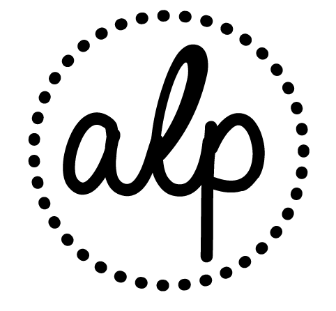
Here I have tried more of a natural font, with a hand drawn feel, i think this reflects me better, it looks more easy going and friendly as a font. I liked this font I just didn't like the extra bit off the 'p' so i removed that on illustrator.
To keep the logo together, I decided to put a circle round it and have it as dots. I like it however i'm not sure about the circle of dots not sure if it looks a bit lost.
After playing with the line weights for a bit I have managed to get the dot look i was going for however now I am unsure about the font as I like the dots better, i'm not sure they complement each other well.
I tried out a variety of fonts to try and compliment my logo, but i found it quite tricky. Here I tried futura.
I found this font online that I really like, I like how it looks neat and structured and the ends of the letters are rounded. The font is called co co goose.
I liked the font so much that I experimented with it in my logo and muched preferred it, I think it works better as well so all the font is the same.
Adding a few vectors so its not too text heavy
I know I want to add some info graphics in but I am not sure how to do this, I experimented with using the logos of the programmes, but I don't think it was very clear what I was trying to show.
I am trying to show how much of each programme I think I know after developing throughout the year. After researching into info graphics I have decided to show it like this, I think this makes more sense to what I am trying to communicate.
I started to design the vectors to add to it, I designed six to show my likes and what I enjoy outside of graphics.
Here are the designs for my business cards that I am going to screen print, I am quite worried about screen printing two sided and alignment issues but I think I need to try it out.
Here is the final piece, I think its looks okay, it was hard to get the balance right of text and image and i didn't want it to look too overcrowded. I have learnt so much in a year its hard to fit it on one A3 sheet, however I only wanted to give a brief overview, I will now go and screen print this I and going to keep it black and print on a light coloured stock.
Here are the colours I have chosen
I saw I really nice citrus stock that wasn't too over powering, I have chosen to use that for my CV styled thing with a deep grey screen printed over the top. To complement the yellow citrus colour I have chosen to go for a fuchsia pink to keep it quite bright, I will print on white card with fuchsia for the business cards and envelopes.